Please wait a moment.

Form
Follows
TouchGT Haptik

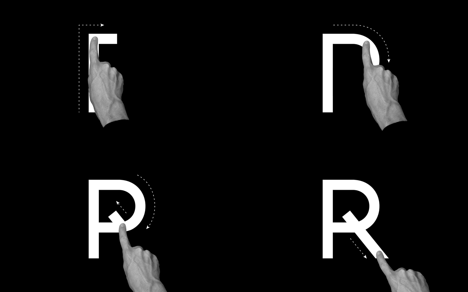
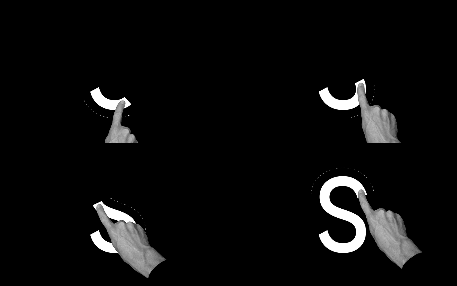
GT Haptik is a monolinear geometric grotesque typeface. Its uppercase letters and numbers were optimized to be read blindfolded and by touching them.

It is now available in seven weights with accompanying Oblique and Rotalic styles. Included with each style come alternate characters as well as proportional and tabular figures.

Click the circle on the left to activate alternates for R C G and 0.

Touch the samples below to discover the different styles.

Lazer
Thin
Light
Regular
Medium
Bold
Black
Monolinear
Geometric
Dreieck
Research
Touchable
Solution
Roman
Oblique
Rotalic
GT Haptik Lazer GT Haptik Thin GT Haptik Light GT Haptik Regular GT Haptik Medium GT Haptik Bold GT Haptik Black

The monolinear uppercase and optically corrected lowercase letters.

Lazer
Thin
Light
Regular
Medium
Bold
Black

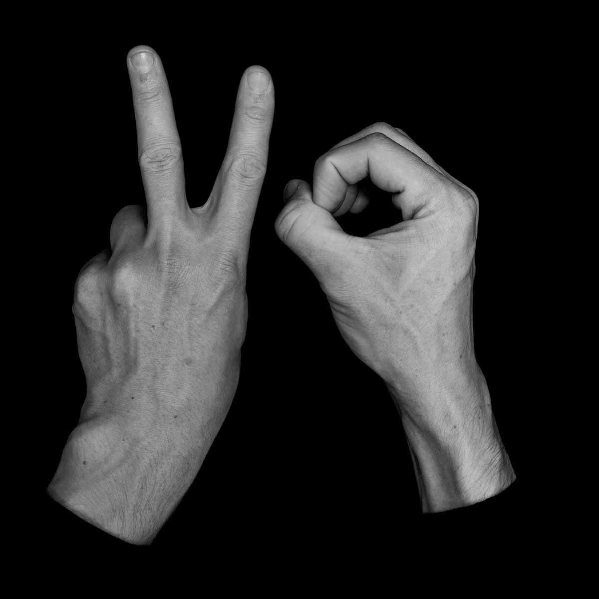
GT Haptik is a monolinear grotesk typeface. It is the result of research undertaken by Reto Moser and Tobias Rechsteiner from 2009 to 2014. The research was concerned with the possibility of reading a Latin typeface by touching it blindfolded. Its uppercase letters function both tactile and visually.

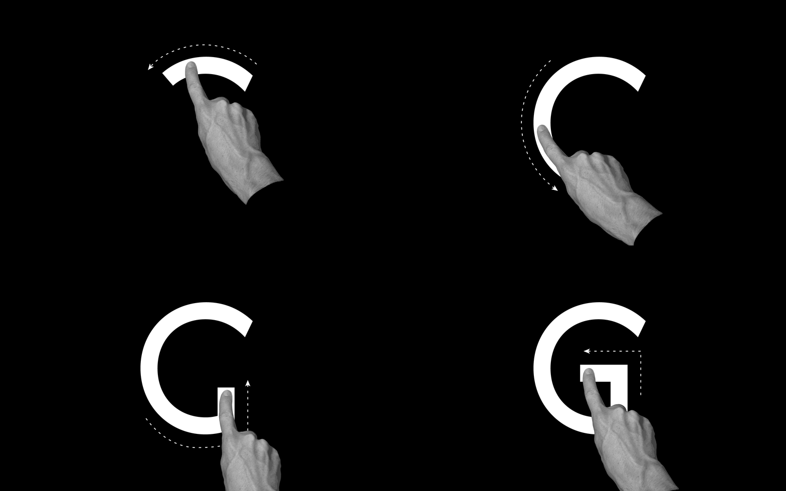
Those specific circumstances lead to the visually unique features of GT Haptik. Optical corrections like the balancing of horizontal and vertical stroke width appearance or the lowering of middle bar in the E are not existing the capital letters and numbers. Additionally, certain letters like the R, C, and G contain specific design elements to help the fingers to follow along.

Lowercase letters were added later, to complement the typeface for text usage. Their design is focused on achieving an optically balanced texture. Lowercase letters would often be too complex to be read by touching, so no considerations in that direction were made in its design.
Off
On
  • Concentric
  • Geometric Body
  • Rhombic
  • Year 2000

Alternate designs available in GT Haptik.